← Work
Tree-Nation Activation Funnel

The form was working.
The data was a disaster.

An 87% conversion rate masked a critical segmentation failure. 90% of users were registering as the wrong account type, flooding sales with manual reclassification work and polluting the CRM. The fix wasn't more clarity. It was better architecture.

Role
Senior Product Designer
Scope
Funnel redesign · 2 iterations
Timeline
3 months measured impact
Outcome
70% improvement in classification accuracy
01. The Hidden Problem

High conversion,
broken segmentation.

Tree-Nation is a B2B and B2C platform where companies gift trees to employees or customers, who then register to claim and plant them. On paper, the funnel was healthy: an 87% registration conversion rate. Strong numbers, no obvious red flags.

But underneath the surface, 90% of users were selecting the wrong account type. Most were employees who had received a gift tree from their company. When registering to claim it, they selected "Company account" because their mental model was simple: this came from my company, so I pick Company.

“The issue wasn’t conversion. It was data quality and segmentation failure.”

Core diagnosis

The system technically knew users were arriving from a gift email, but since gifts could also be sent to companies, automatic account type assignment wasn't possible. The misclassification cascaded through the entire operation: sales manually reclassifying hundreds to nearly two thousand users per month, a CRM corrupted with bad data, and users landing in business-oriented dashboards when they expected a personal experience.

Scale of the problem

500–2,000 users/month misclassified

Volume varied with company campaigns and seasons. At peak, nearly two thousand users per month entered sales' reclassification queue, a task that had become part of the team's daily routine.

Operational cost

Weeks of manual work, recurring

Reclassification wasn't a one-off. It was a persistent drain: daily manual effort that had normalized into the sales workflow, making the underlying design problem invisible to anyone not looking at the data.

02. Research & Diagnosis

Users didn't care about
account type.

We approached this as a diagnostic problem first. Funnel analysis with tracked events (traffic source, account type selected, post-registration tree planting), combined with Hotjar session recordings, journey mapping, and competitive benchmarking.

01

Funnel analysis

Tracked events from entry point to post-registration activation revealed the drop-off pattern and confirmed the scale of misclassification. Traffic source data was key: the majority of wrong selections came from gift email entries, users whose goal was singular and immediate.

02

Session recordings

Hotjar recordings showed users scanning quickly and selecting “Company” without reading the explanatory copy. This was the first signal that clarity-based solutions would have limited effect. The cognitive load of “which type am I?” was being resolved by environmental cues, not by what the form said.

03

Journey mapping

Mapping the full gift recipient journey exposed the mental model collision: the user's context was "my company gave me this" and the registration UI presented an equal-weight choice between Citizen and Company. The architecture was creating a false choice where there was none.

Key insight

Users were goal-driven, not type-aware.

They had one objective: claim the tree. Account type selection was an obstacle, not a meaningful decision for them. This meant that no amount of explanatory copy would reliably guide behavior; users weren't reading because the question didn't feel relevant to their goal. The intervention needed to be structural, not communicative.

03. Design Process

Two iterations.
One fundamental shift.

We worked closely with the PM and CEO throughout. The CEO was initially hesitant to make deep changes: the form had required significant prior investment and was converting well. Getting from Iteration 1 to Iteration 2 required three months of data and a shared shift in diagnosis: the problem wasn't clarity, it was hierarchy.

Iteration 1: Structural Clarity & Friction +37% improvement in correct classification

Our first hypothesis was that the misclassification came from insufficient explanation. We restructured the form to surface the account type decision earlier, added clearer copy, and introduced friction for the business path to slow down users who might be making the wrong choice instinctively.

Change Moved account type selection to Step 1 to front-load the decision
Change Added clearer explanations and progressive disclosure per account type
Change Introduced contextual warnings when “Company” was selected
Change Increased friction for business accounts with additional required fields
Change Refined UX writing in collaboration with PM

The 37% improvement was meaningful, but misclassification remained too high. Session recordings from this period confirmed the core issue: users still weren't reading. The intervention had improved the form, but the underlying architecture still treated both account types as equally valid choices for every user arriving at the page.

Iteration 2: Behavioral Reprioritization 70% improvement in correct classification

After three months of post-Iteration 1 data, and a candid conversation with the PM and CEO about what the recordings were telling us, we shifted strategy. Instead of explaining more, we changed hierarchy.

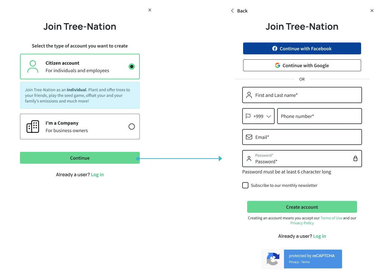
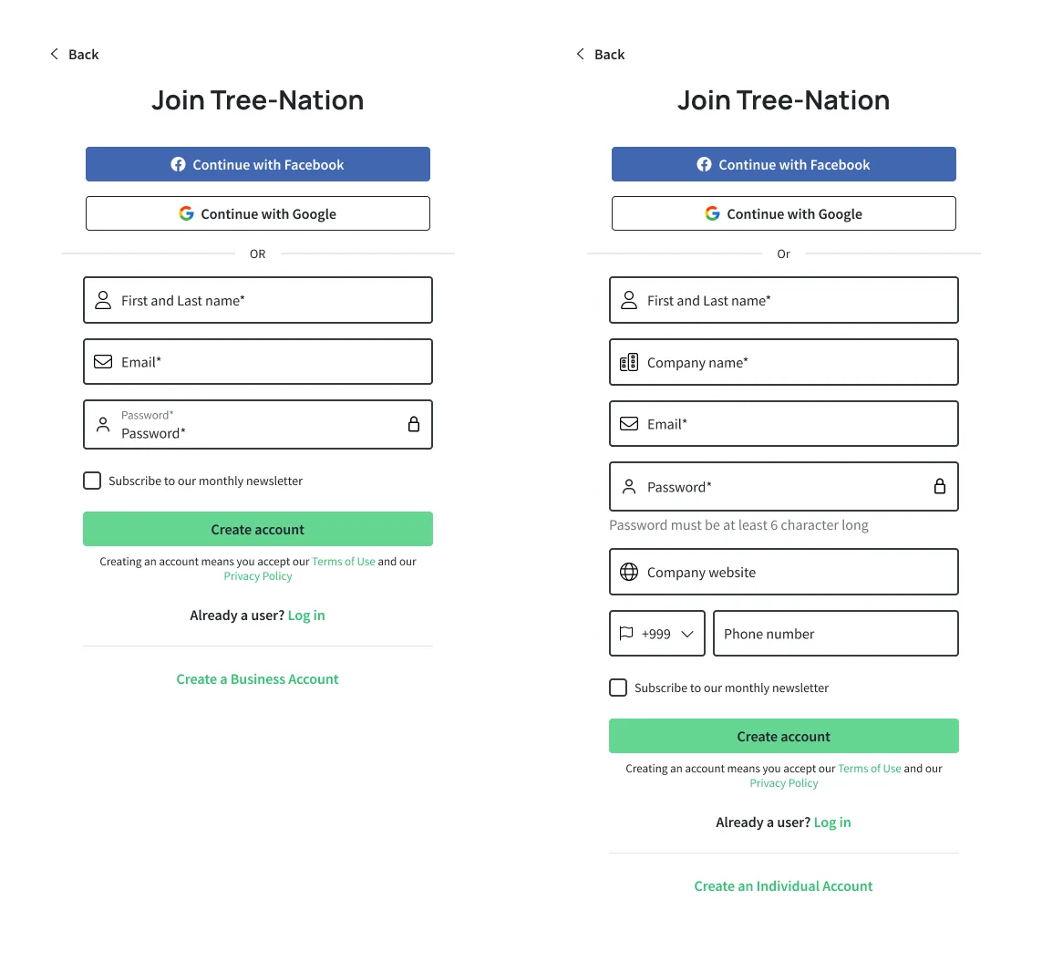
The insight was that segmentation doesn't need to be technically detected when it can be behaviorally guided. 90% of users arriving at registration were citizens. We designed for that reality.

Change Removed equal visual hierarchy between account types
Change Made Citizen the implicit primary path: default form, prominent position
Change Moved “Create Business Account” to a tertiary CTA below the main form
Change Reduced visibility of the business option without removing it

This was a deliberate choice to guide segmentation through architecture rather than explanation. Business users who needed a company account could still find the option, but they would need to actively seek it, which is appropriate behavior for someone with a genuine business intent.

Original registration form with equal hierarchy between citizen and company account
Original form: “Register as a Citizen” and “Register as a Company” presented with identical visual weight. No account type context, no friction differential.
Iteration 1 registration form with account type surfaced first and added friction for company accounts
Iteration 1: Account type surfaced as Step 1 with explanatory copy and distinct paths. Company account adds required fields (phone number) to increase friction. +37% improvement in correct classification.
Iteration 2 registration form with Citizen as the primary path and business account as a tertiary CTA
Iteration 2: Citizen form is the default experience. “Create a Business Account” is a tertiary link below the fold. Equal hierarchy eliminated. 70% improvement in correct classification.
04. Results

Architecture solved what
copy couldn't.

The final iteration delivered a 70% improvement in account classification accuracy, measured over three months against the pre-intervention baseline. Overall conversion performance remained strong throughout both iterations.

70%
Improvement in correct account classification accuracy after Iteration 2
From near-total misclassification
Manual reclassification by sales reduced from a daily recurring task to an edge case
500–2,000 users/month no longer misrouted
87%
Overall conversion rate maintained: segmentation was fixed without breaking the funnel
No regression in acquisition performance

Beyond the headline number: CRM data quality improved significantly, post-registration experience alignment improved (users landing in the dashboard that matched their actual context), and sales recovered operational bandwidth that had been consumed by a problem the team had normalized over time.

05. Reflection

What I'd tell
my future self

The hard part

The CEO wasn't ready to move after Iteration 1.

The form had required significant prior investment and was still converting well at the surface level. Proposing deeper architectural changes (ones that deliberately reduced the visibility of a whole account type) felt risky from a product ownership standpoint.

What got us through it was data. Three months of post-Iteration 1 recordings and classification metrics made the case that clarity-based interventions had a ceiling. Once the PM and I reframed the question from “how do we explain the choice better?” to “should this even be an equal choice?”, the path forward became clear, and the CEO came with us.

This is the kind of stakeholder work that doesn't show up in a Figma file. Learning to build the case for a structural intervention (not just a visual one) is a different skill than design craft, and one I'm actively developing as I move toward Product Lead roles.

What worked

Letting data carry the argument

Running Iteration 1 before proposing the more aggressive Iteration 2 turned out to be the right sequencing. It gave us three months of evidence that the incremental approach had a ceiling, which made the behavioral reprioritization feel like a logical next step, not a risky gamble.

What I'd change

Earlier hypothesis about hierarchy

Looking back, the session recordings from before Iteration 1 already showed users not reading copy. I could have formed the “architecture over explanation” hypothesis sooner. The three-month gap between iterations was useful for stakeholder alignment, but the design insight was probably available earlier.

06. Takeaway

Segmentation is a
design decision.

The most interesting thing about this project is that it wasn't really about the form. It was about understanding that when user intent is dominant and goal-driven, trying to teach users something mid-task is a losing battle. The right move is to design for the behavior you actually observe, not the behavior you wish users had.

Deliberately reducing the visibility of an option felt counterintuitive at first. But it was the most honest design decision we could make: one that served the 90% without eliminating the path for the 10%. That's the kind of thinking I'm most proud of here. Not the UI. The argument.